Character Sprites -- Free -- NSFW
A downloadable asset pack
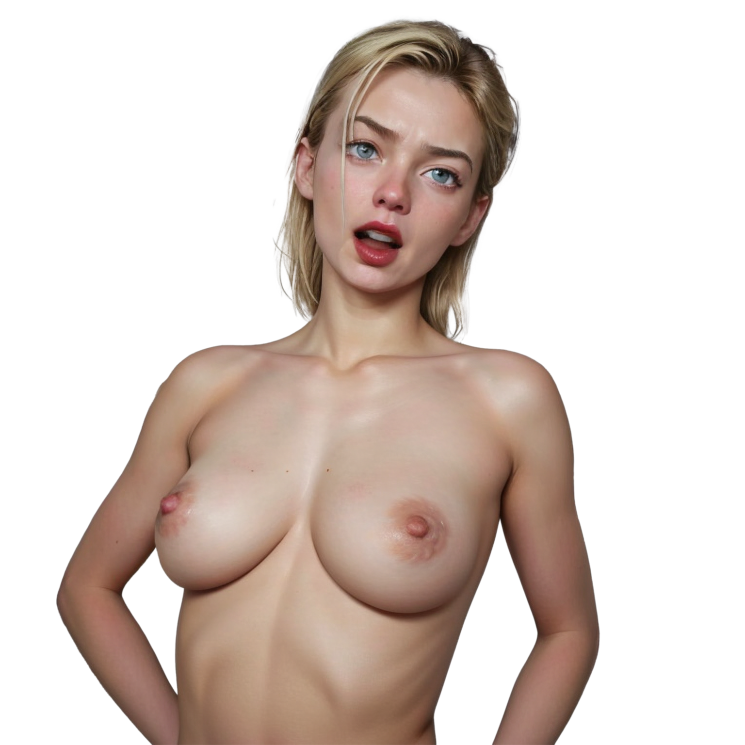
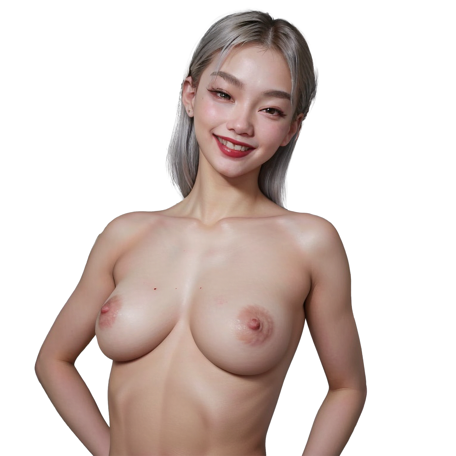
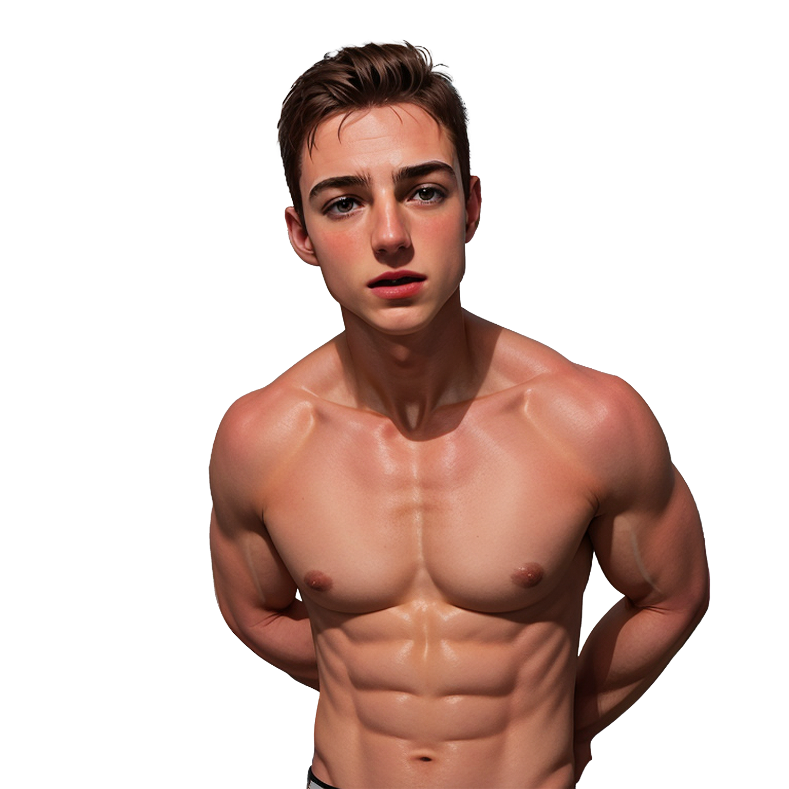
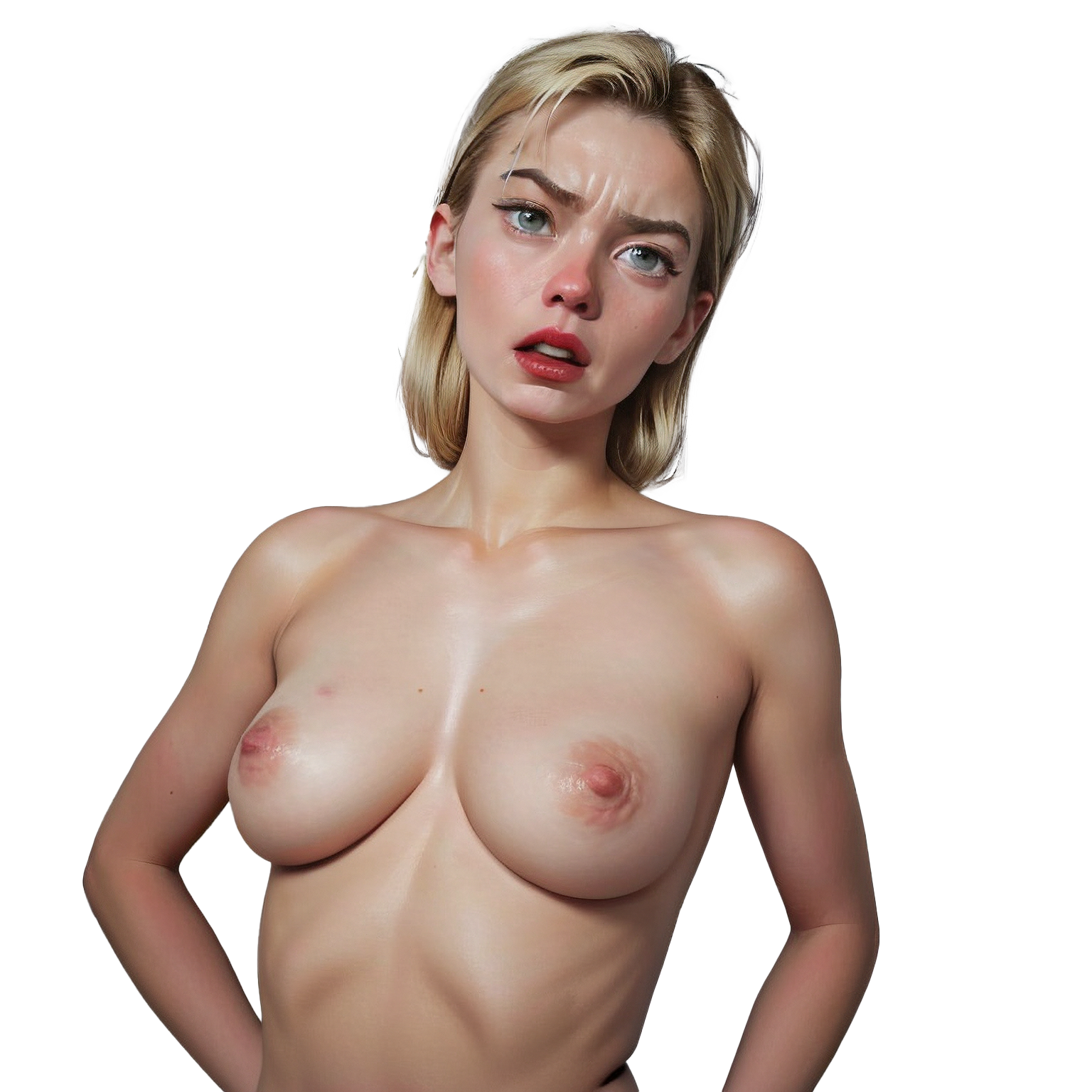
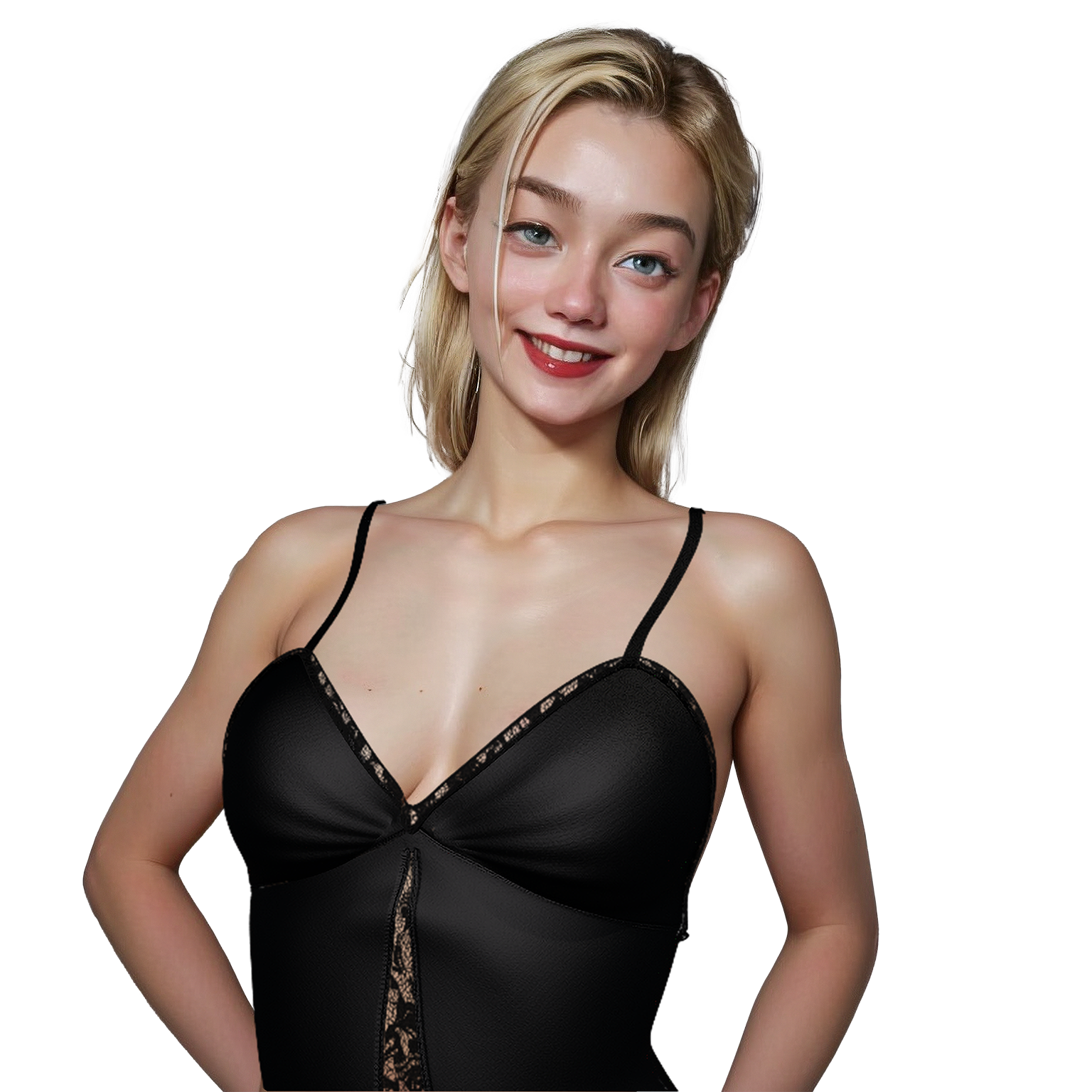
Hello, I have a few character sprites you can use, for commercial or non-commercial use, for free. If you use the art, please send me a link so I can see how you use it. This first pack is Semi-Realistic. It has 3 characters with one pose (1 male, 2 female). Each pose has a few different expressions. There are a few outfits for each, which you can overlay on the characters. The outfits should fit fairly well, though with a little work in Photoshop, you can make them work the way you'd like.
My workflow is to render each scene in Daz Studio, then "re-texture" each image in Stable Diffusion. I have been able to achieve a consistency in characters this way that I'm happy with.
If there is enough interest, I will expand this pack. I am working on a Toonish pack that is almost completed.
My Goals
I've realized that I like experimenting with AI art mixed with Daz Studio, but I get bored once I start trying to create a game. So, my hope is to find someone who'd like to collaborate. By giving these away free, I can get feedback that can be used to improve my process.

Here is an example of the Toonish version I am working on.
Download
Click download now to get access to the following files:
Comments
Log in with itch.io to leave a comment.
sorry if isnt the place for contact you. im audio vide artist, .. I am writing to you because I am responding to your appeal regarding the search for collaborators. we are aligned in many aspects and above all I am foraying into the same sector as you vr360 rec realistic. as for rpg maker or similar I have experience to do it as you say. open to experimenting with new styles. If you are looking for a serious experimental artist i can spend my time for make only the best product. don't hesitate to contact me i will show you my art. best regards
c
did you... thanks mate
C
A or B, I'd say. I also agree with the point about the breasts that ShuangShuangPan said.
C
A
C or A.
C
A or B also keep Ella body shape from pics above. Boobs body portion dont match.
C
+1
i guess i have really bad taste since i like B the most :(
I think the characters have a "cuteness to them". I thought about doing the game as a fantasy story (elves and such), and if I did I think I'd go with the more cartoony look like B.
Hello mate,
If you're going with a comicky/cartoonish type of story I thing is actually better that you go with A - It struck me immediately how it reminded me of comic art style of the likes of Jaguar and aroma sensei.
I get what you mean about B, which looks very enticing, but i think the reason is because B art definetly looks 'younger', (like they look underage like 15-17ish) and very cute, which does go great with an adventure 'alice in wonderland' kind of cartoon game - but the color contrast is a bit too dark/shadowy, and makes it seem like the art is a bit noisy/dirty- whilst A seems very clear and cleaner, which is very easy in the eyes, and gives a better vibe for comic backgrounds.
Still if you want to go with B i would try to combine both A and B - or make B a bit clearer.
Thank you for making this art, looks GREAT (Both A and B), and yes C is very well done of course, but mybe too realistic, which makes the expressions a bit to dramatic. (the first C ella should be in a museum tho', its fantastic!) but the duo C has that movie sad-eastern-europe type of vibe. - So yeah A for me, B is very sexy too. Cheers!
Best eyes; B > A > C
(pelase dont use duo C's sad eyes like they have been smoking since thery were 10)
good job Sr. How can I communicate with you?
left girl C/A...right girl A/B
C>A>B
c
c
Option C looks really good.
A and B look fine but C definitely stands out.
I guess I would rank C>B>A
C>>>A>B
A looks really lifeless in the eyes, especially on the left character in fullscreen. B has that uncanny valley look others have noted. C has a bit of weird artifacting on the left character's nipples, but otherwise looks the best.
I agree with Nederbeest C > A > B
Thank you for the feedback. I think I'm going to do up another character in the more realistic style, and get some feedback.
C > A > B
The realistic one, huh? I'm actually surprised I'm getting better feedback on that one. Most visual novels seem to be a little more in between real and animated. I started out wanting to do realistic, so this might motivate me to try to perfect it. The most challenging part will be the backgrounds, and making the realistic characters fit in.
B gives strong uncanny valley. A if you want to go with a more traditional "game-y" look, C gives more of a photoshopped celebrity parody game kinda look
I think I might end up going with the more realistic one. I did use a few celebrities to inspire both of these characters. Out of curiosity, can you tell which ones I used?
Left girl no clue, right girl i have some ideas, but none feel quite right. Could be Emma Watson, or Emma Stone, or maybe Cara Delevigne? but could just as well be anyone else, really :D
I kow it's al lot of work, but I prefer C
The most work for C will be on creating backgrounds that will fit with the characters.
Show post...
A and C are both cool. I'm not digging B.
Just curious, is it that the style of B seems to age the characters down a bit? I don't think I'm going with that style, but if I did, I planned on making some adjustments to get them to look a tad older.
Show post...
I don't think it's maturity. They just seem off.
Thank you. I'm experimenting a lot with different styles, so I need to get a feel for why different images resonate, while others don't.